A colleague went on holiday and one of our services quietly stopped. Not because the work was hard, but because nobody else had touched that repo in a year. Everybody sort of knew this. Nobody had said it out loud before it hurt.
Knowledge concentration is invisible right up to the moment that you need that knowledge.
The usual answer, which doesn’t work
The default reaction is documentation. Write it down, then anyone can pick it up. In my experience that mostly produces outdated artifacts nobody reads and a false sense of safety. The theory of the system does not fit in a wiki page. It lives in people.
The second default is “we’ll spread it later, when things calm down”. Things never calm down. What you need is something that makes the risk concrete now, in the same conversation where you plan the next quarter.
So I built a heat map
As promised last time, I polished and published the script I used to build a Knowledge Heat Map of the services and components a team maintains. It is on my github, with install instructions: github.com/nkrijnen/git-knowledge-heatmap.
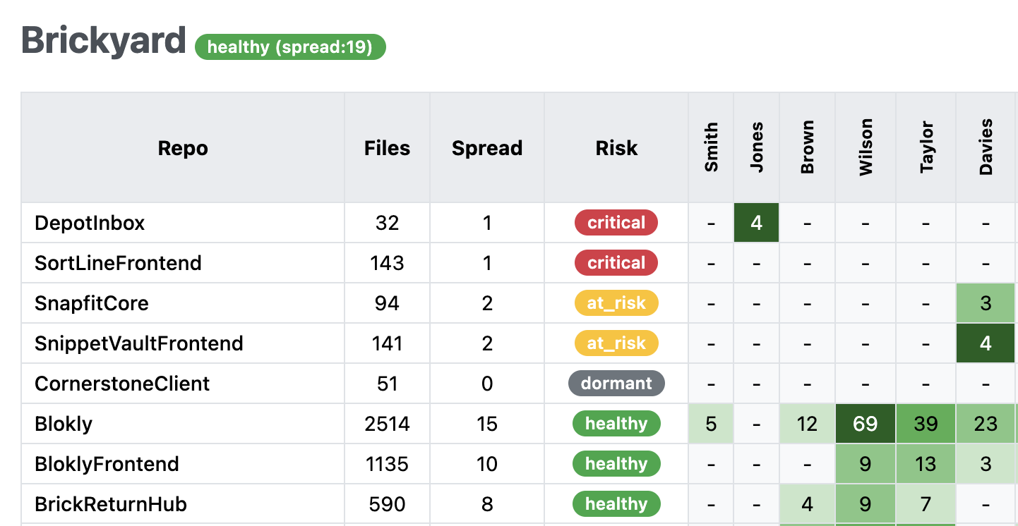
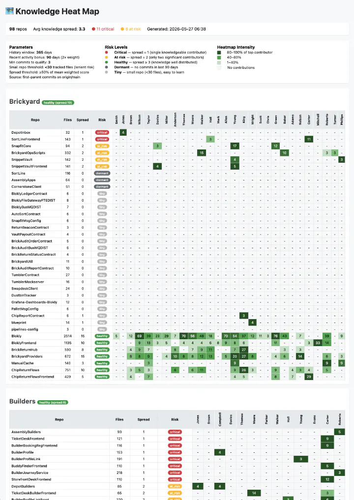
It walks every git repo below the folder you point it at, reads commit history, and scores per repo how many people still have a meaningful footprint in it. Recent work counts double. Tiny repos get judged more leniently, because a thirty file repo is learnable in an afternoon. The output is one self-contained HTML file: repos as rows, people as columns, colour as depth of involvement, and a risk level per repo.
Red means one person. Amber means two. That is the whole idea.
Below an example of what it looks like on a “real” portfolio: an example Knowledge Heat Map. Ninety-eight repos, eleven of them critical.
Why commit history works well enough
Git history is a weak proxy for knowledge. It knows nothing about the person who did the design, reviewed everything and never pushed a commit. It cannot see pairing unless you trail the co-authors. It rewards whoever ran the dependency bumps.
I still use it, for one reason: it is the only signal about knowledge that is already there, in every team, for free, without asking anyone to fill in a survey about their own confidence. Self-reported knowledge maps drift towards politeness. Commit history does not care.
So treat the colours as questions, not verdicts. Red repo with a name you did not expect? Go ask. Half the time the answer is “oh, three of us know that one, we just mob on it and only one person pushes”. Good. That is the map correcting itself, and the conversation was worth having anyway.
When to use it, and when to leave it alone
Use it inside a team to decide where to pair next quarter. Use it in portfolio or capacity conversations, where “this service has a bus factor of one” lands harder than a general plea for knowledge sharing. Use it before someone leaves, rather than during their notice period.
Do not use it as a performance signal. The moment people work out that appearing indispensable is rewarded, or that appearing replaceable is punished, you have built an incentive to hoard. That is the exact opposite of what you wanted. If you cannot show this map to the team it describes, do not run it.
And do not use it as your only lens. It is a trigger for a discussion, not a substitute for one.

What it still cannot do
It works at repository level, which is fine for a service-per-repo landscape and useless for a monolith. One big repo shows up as a single healthy green row while the four modules inside it each have a bus factor of one. Splitting the analysis by subdirectory or module is the obvious next step. I have not built it. The repo has a spec and test suite that was used to build the script with AI, fork it if you need it sooner than I do.
Which leaves me with the question… repos are a convenient unit because git hands them to us, not because they match how understanding is actually divided. What would a heat map look like if it followed the boundaries in the domain instead? And how could we detect those boundaries in the codebases we use?